E-Waste Gincana Platform for an NGO — Competition Winner
Research, personas and three screens on the entry that won, against fourteen teams.
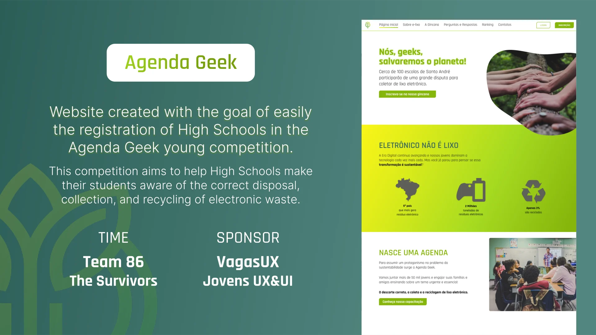
A platform for an NGO's inter-school e-waste collection contest: schools register, track their collection on a live ranking, earn badges and reach the NGO. Designed over five months in a team of three against fourteen competing entries, and won. Mine was the primary research — nine in-depth interviews carried through to an analysis grid that traces every insight back to the quote that produced it — plus the personas and journey, co-ownership of the user flow, and the registration, FAQ and school-profile screens. The team lead was someone else, and the platform was never built.
- Role
- Designer within a three-person competition team — owned the registration, FAQ and school-profile screens, ran the interviews, built the personas and journey, and co-owned the user flow
- Timeframe
- Jan 2022 – May 2022
- Stack
- Figma
- Evidence
- Design + code
- Design file

Develop a website to help schools that want to join the Agenda Geek's gymkhana, explaining the main points about e-waste and removing the main doubts about how the Agenda Geek works.
This project is a brief of the Challenge “Ajude uma ONG” promoted by the communities “Jovens UX&UI” and “VagasUX” with a duration of 5 months (Jan – May 2022).
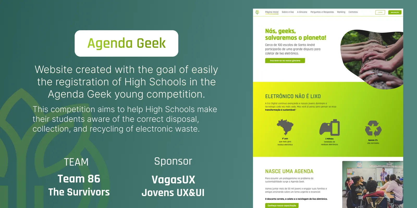
Solution
- To demonstrate in a simplified way how the schools involved in the gymkhana are progressing, as well as to stimulate the engagement of the participants.
- Provide fast means of communication.
- Facilitate access to required and key documents.
Summary
- Context (Main Challenges).
- Discovery & Ideation (Design Process)
- Design, Prototype & Deliverable (Results)
- Next Steps & Learnings (Roadmap)
- 86 Team - The Survivors! (Who made this project possible)
Context
Brazil currently ranks 5th of the top countries that generate the most electronic waste. According to a report developed by the United Nations University, Brazil disposed, in 2019 alone, more than 2 million tons of electronic waste, and less than 3% of this volume was recycled. - Green Eletron’s Report.
An increasing problem…
- 2 MILLION
- tons of eletronic waste
- -3% Recycled
- Percent of recycled e-waste
Source: Report developed by the United Nations University.
1🧑 = 2📱💻 devices
Of the 440 million total devices 53% are cell phones and the other 47% are computers/notebooks/tablets.
Discovery & Ideation
Desk Research
We began this stage by doing desk research to better understand the segment where the NGO Agenda Geek operates. The participants read the reports and materials provided and we consolidated the knowledge generated in a Problem Statement Framework (CSD Matrix). In this Framework, we group the information according to the project's stakeholders by affinity (key factors evaluated: Schools, Students, Parents, Agenda Geek, Sponsors, Partners).
Competitor Analysis
To evaluate the positioning of Agenda Geek in relation to its main competitors, we conducted an analysis that allowed us to raise NGO strengths and opportunities for improvement.
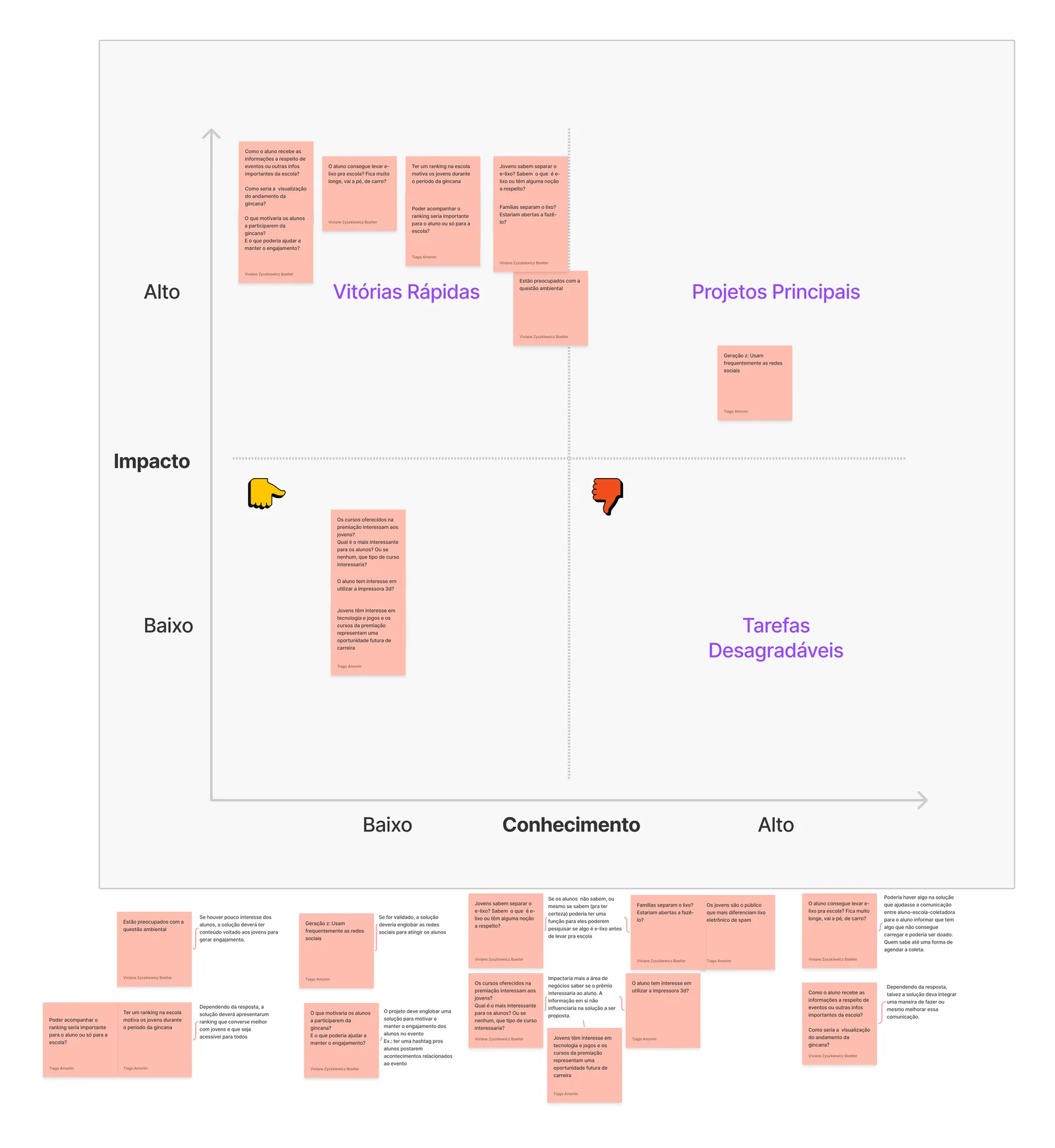
Impact x Knowledge Matrix
The group prepared 6 proto-persons based on the research done up to this stage. This study helped us to better target the doubts and questions that would be taken to the interview stage.
During the development of proto-personas, we updated the Problem Statement Framework (CSD Matrix) to check if any questions had not been addressed. At this stage, the group raised many interesting points for the project and because of this, we felt the need to prioritize the questions that would follow for the user research. To define the priority we developed an impact x knowledge matrix for only four proto-personas (students and schools).
Interviews (Attitudinal & Qualitative)
For the in-depth interview stage, we chose to follow up only with only the Student and School proto-personas, because we believe that by focusing on solving these problems we would have a greater impact.
Designing the Script
With the doubts and insights of the research summarized, the group gathered in an affinity map the main doubts grouped by themes, and then we held another meeting to verify the main doubts and define the most adequate research method to solve them.
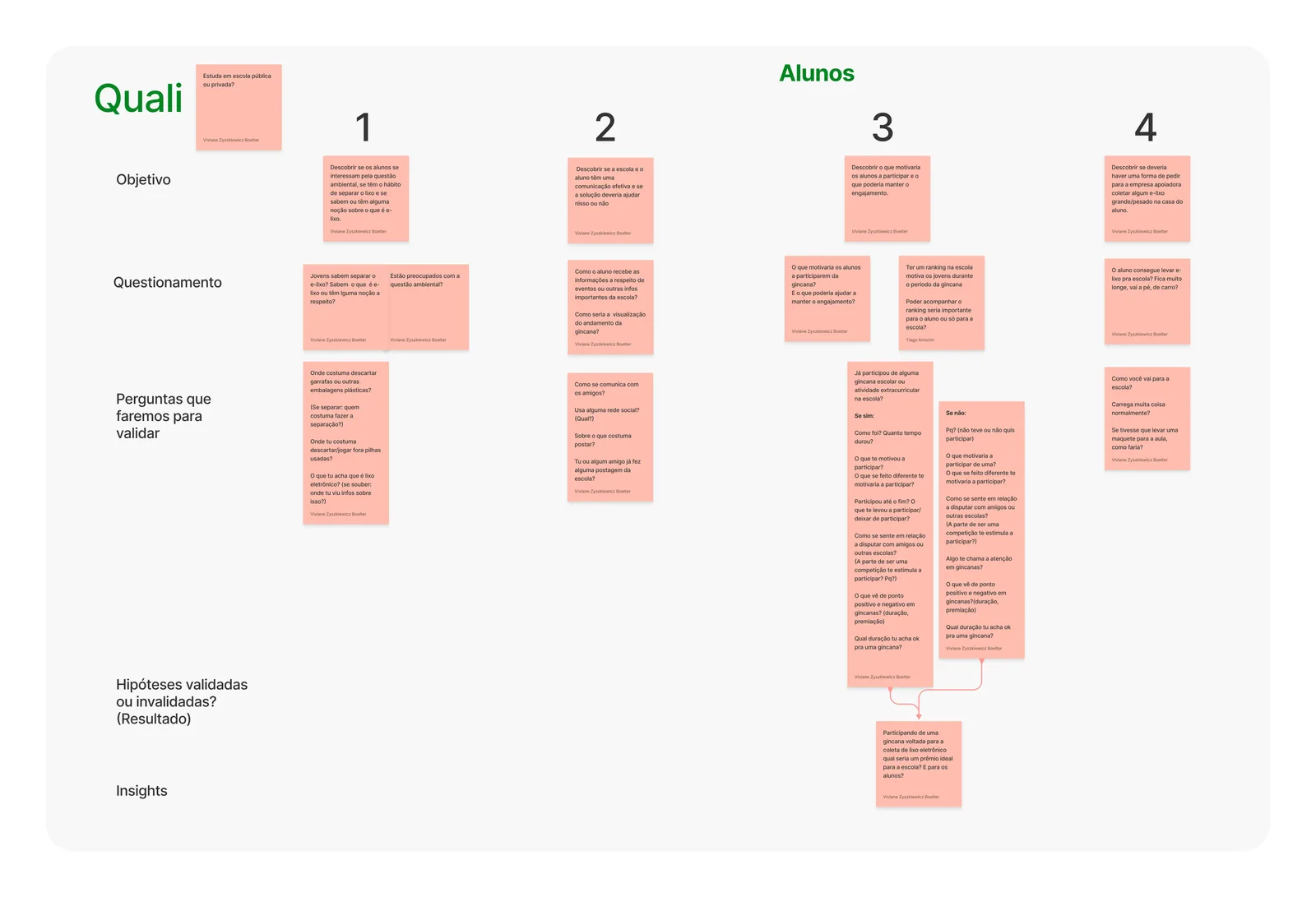
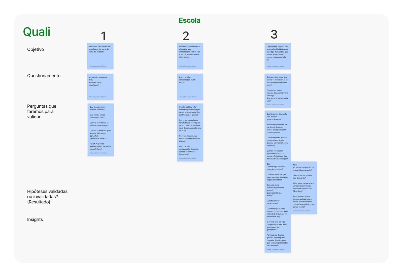
Conducting the interviews
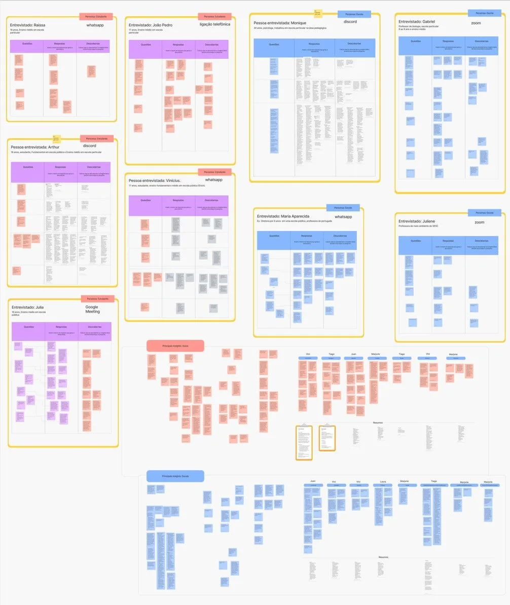
- 9 📹
- Interviews
- 4 🧑🏫
- School representatives
- 5 👲
- Students
The research results were gathered into a new affinity map, where we separated the main insights from the interviews.
Design, Prototype & Deliverable
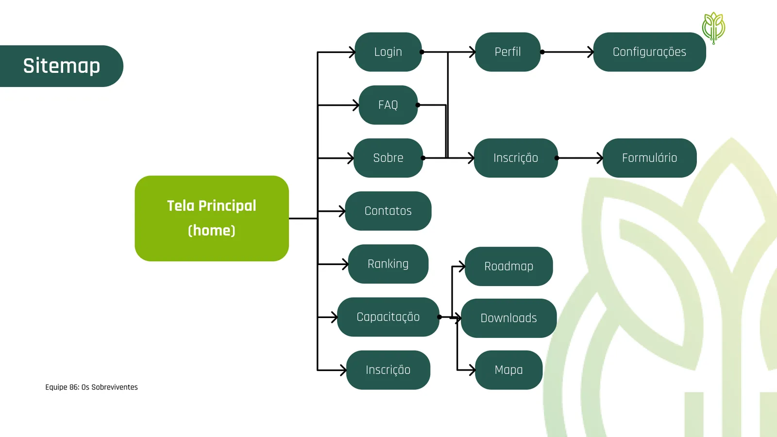
User Flow
From the ideas that were prioritized in the previous step, we thought about the sections and steps that should exist to help the user in his journey, creating a user flow.
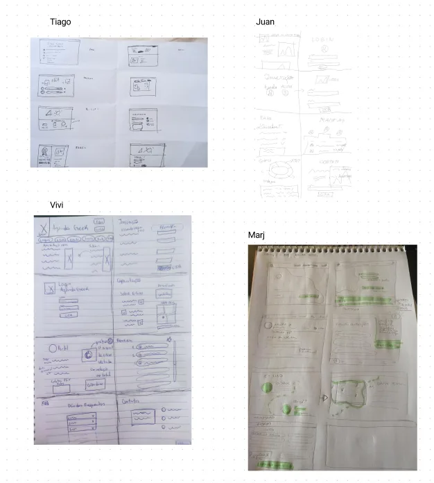
Crazy 8’s
Next, the team met for the Crazy 8’s exercise. Based on the sections and steps thought out in the previous stage, each team member conceived 8 functionalities for the solution. After each member explained their ideas to the whole group, we started voting and prioritizing those that the group thought would bring more results.
Wireframes
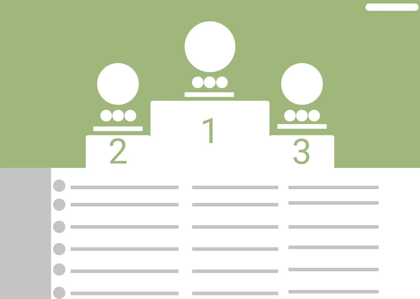
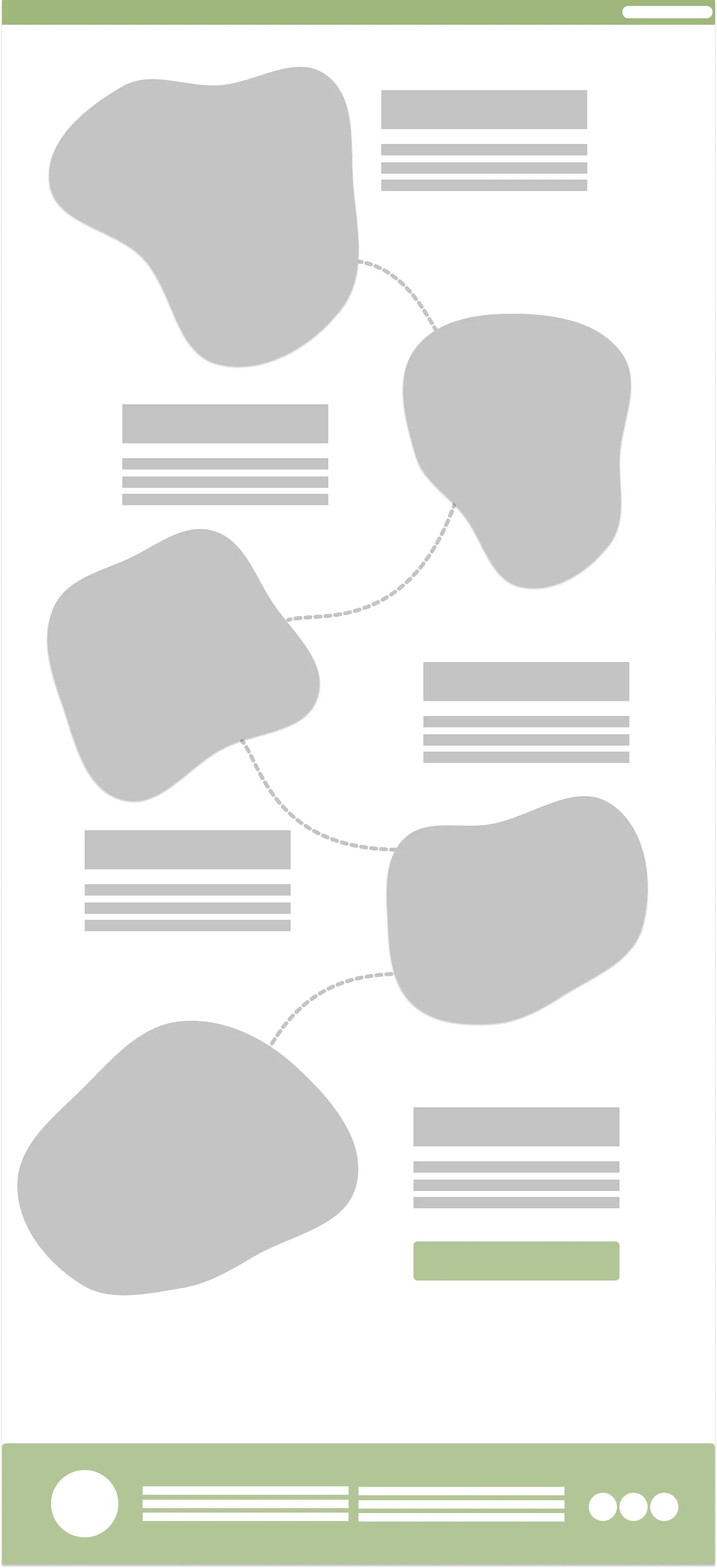
Wireframes were made for each design that was prioritized in the previous stage. The wireframe helped the team to better understand the concept of the site and to design the necessary flow for the user to learn about the contest, register, measure the results and contact Agenda Geek.
![School Profile]](https://cdn.juanpablosilva.com.br/juansilva.design/cases/agenda-geek/d2702d5dd65f.webp)
🎨 Style Guide
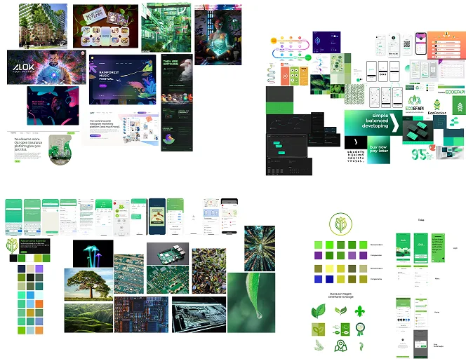
To build the Style Guide we took into account the archetypes and choices made by the NGO in the dynamic that was performed together with the mentors. From the main points, the team developed Mood Boards to inspire the choice of colors and fonts. The main focus was to bring technology associated with nature.
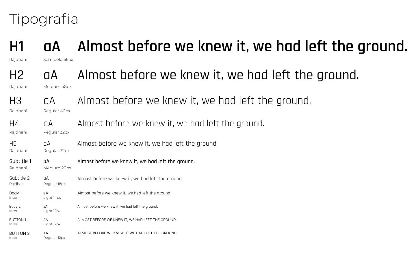
Typography
Design System
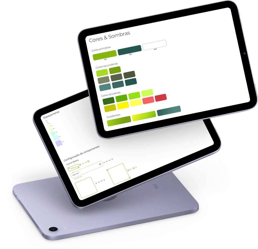
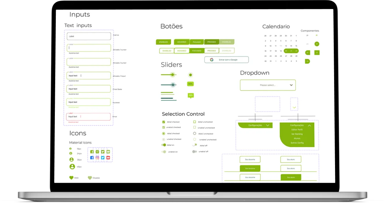
With these basic definitions, the team started the work of creating the base components. Besides gaining more agility in the development of the components, we could guarantee the consistency of the elements and increase the productivity of the project's team of developers. All the component descriptions can be found in the Figma file.
💬 UX Writing Guidelines
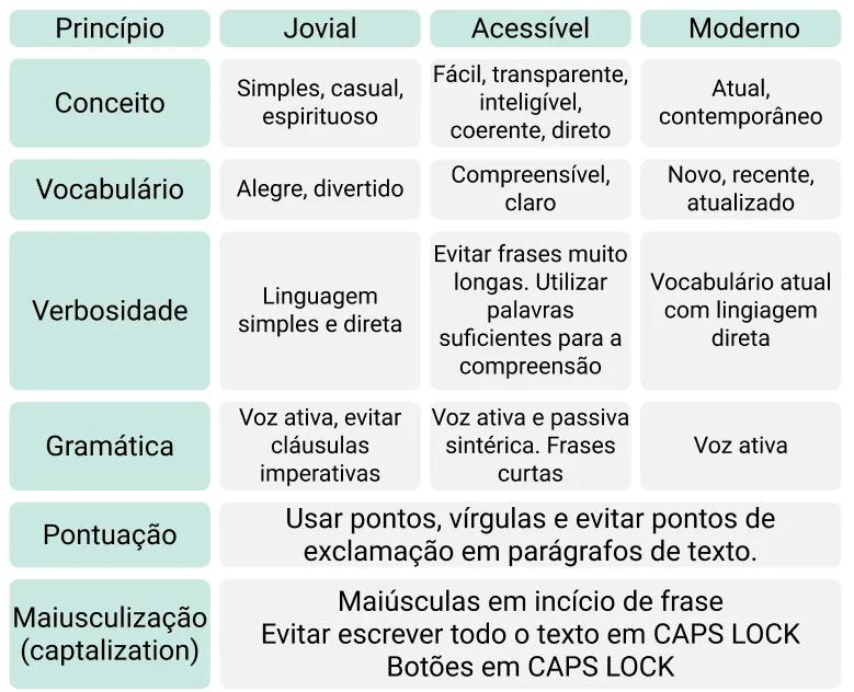
The voice of the Agenda Geek website was designed based on the interview with the founder of the NGO, and, from this, a voice chart was created. The voice chart is an important guide for the content to be aligned with the objectives of the organization and the people and can be used as a decision tool. The chart contains each product principle in a column, and for each principle, each of the six aspects of voice is defined in a different row: concepts, vocabulary, verbiage, grammar, punctuation, and capitalization.
General Guidelines
- Title: up to 45 characters
- Body text per section: up to 160 characters
- Button(s): up to 25 characters each
Voice Chart
Thus, the tone of voice thought of is more enthusiastic, since one of the attributes that represent the brand is passion; more respectful than irreverent since it deals with a serious subject and should be accessible to all ages. The tone is also more casual, which can be understood by various age groups, and pulls towards a more relaxed side since the intention is to be accessible and jovial.
Voice Tone
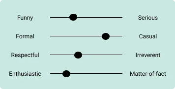
Thus, the tone of voice thought of is more enthusiastic, since one of the attributes that represent the brand is passion; more respectful than irreverent since it deals with a serious subject and should be accessible to all ages. The tone is also more casual, being able to be understood by various age groups and not too serious, but funnier, as the intent is to be accessible and jovial.
Checking the Evidence
After having elaborated the texts that would appear in the prototype within the parameters mentioned above, we used the Hemingway Editor tool to make sure that the designed sentences were simple and easy to understand. According to the tool's own website, the ideal is that the text presented be understandable to students from the 9th grade on, and the project's screens are within this spectrum.
📦 Prototype
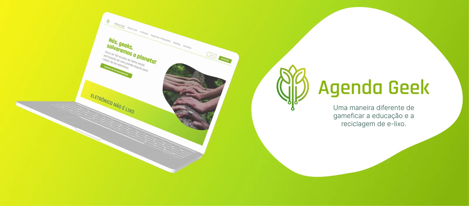
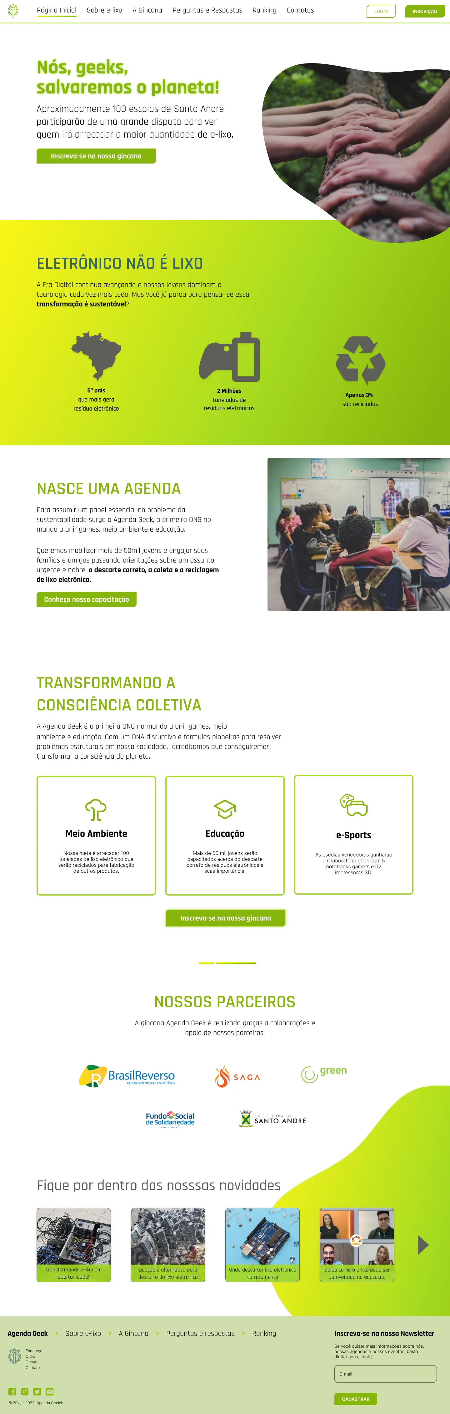
Content
Next, we present a table explaining why each screen was created to help developers and explain the concept behind the solution.
🧪 Usability Testing
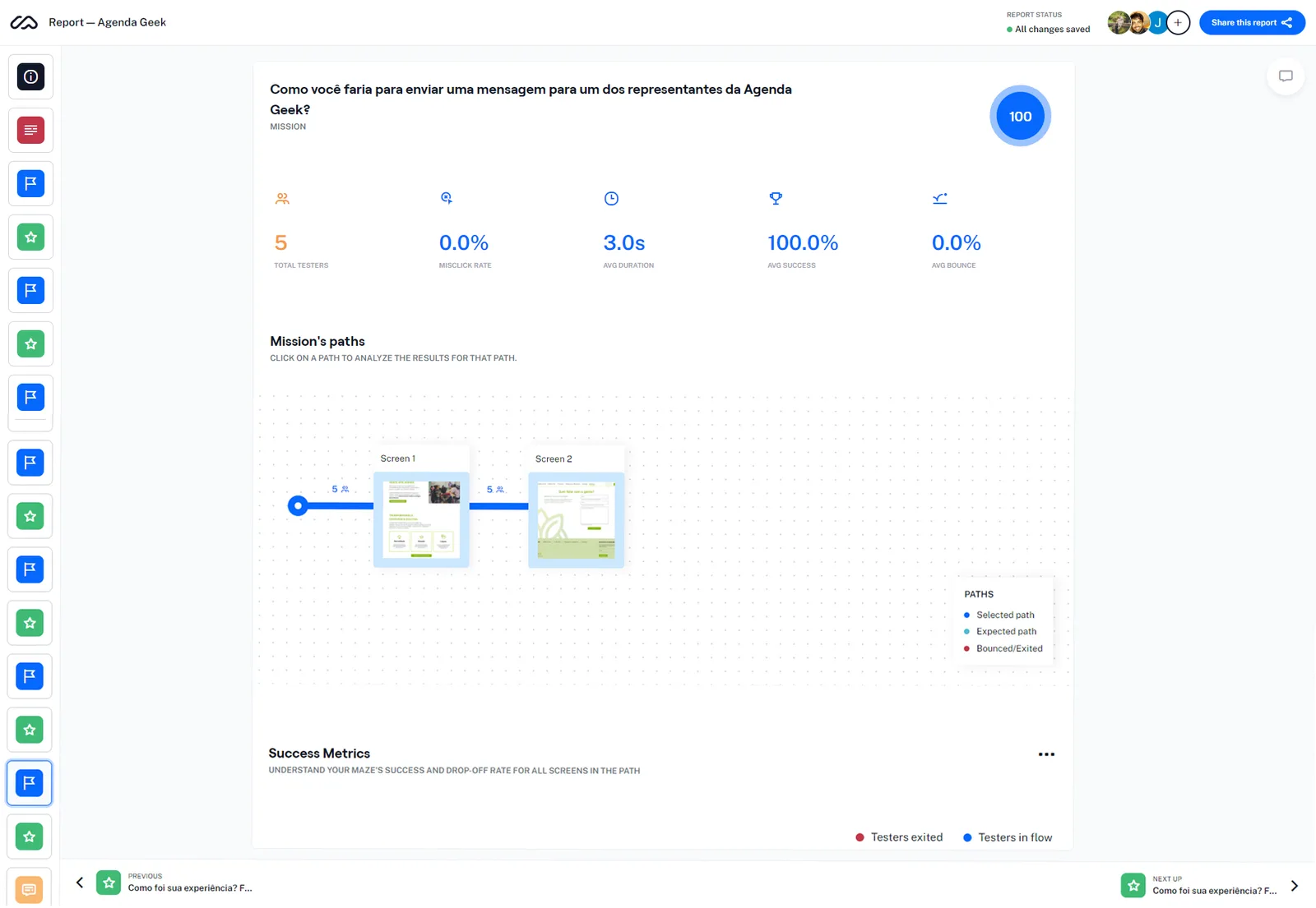
In this step, to verify that the concept and navigability were in line with the user's needs, we applied an unmoderated usability test using the Maze tool and the high-fidelity prototype.
Usability test script (expand)
- 6 👥
- Applied Tests
- 4 ✅
- Tasks
- 68 🟡
- Maze’s Score
According to Maze, and taking into account the indicators of task success, duration, and test abandonment, the prototype got an average score (of 68).
Due to the delivery time, we were not able to conduct moderate testing to assess the main difficulties in the prototype. However, according to the feedback from the participants, the main difficulty was understanding how the Maze works and that is why they had difficulty completing some tasks.
The team's recommendation would be to perform 5 moderate tests to validate the feedback or evaluate possible changes to the prototype.
🎬 Project Presentation
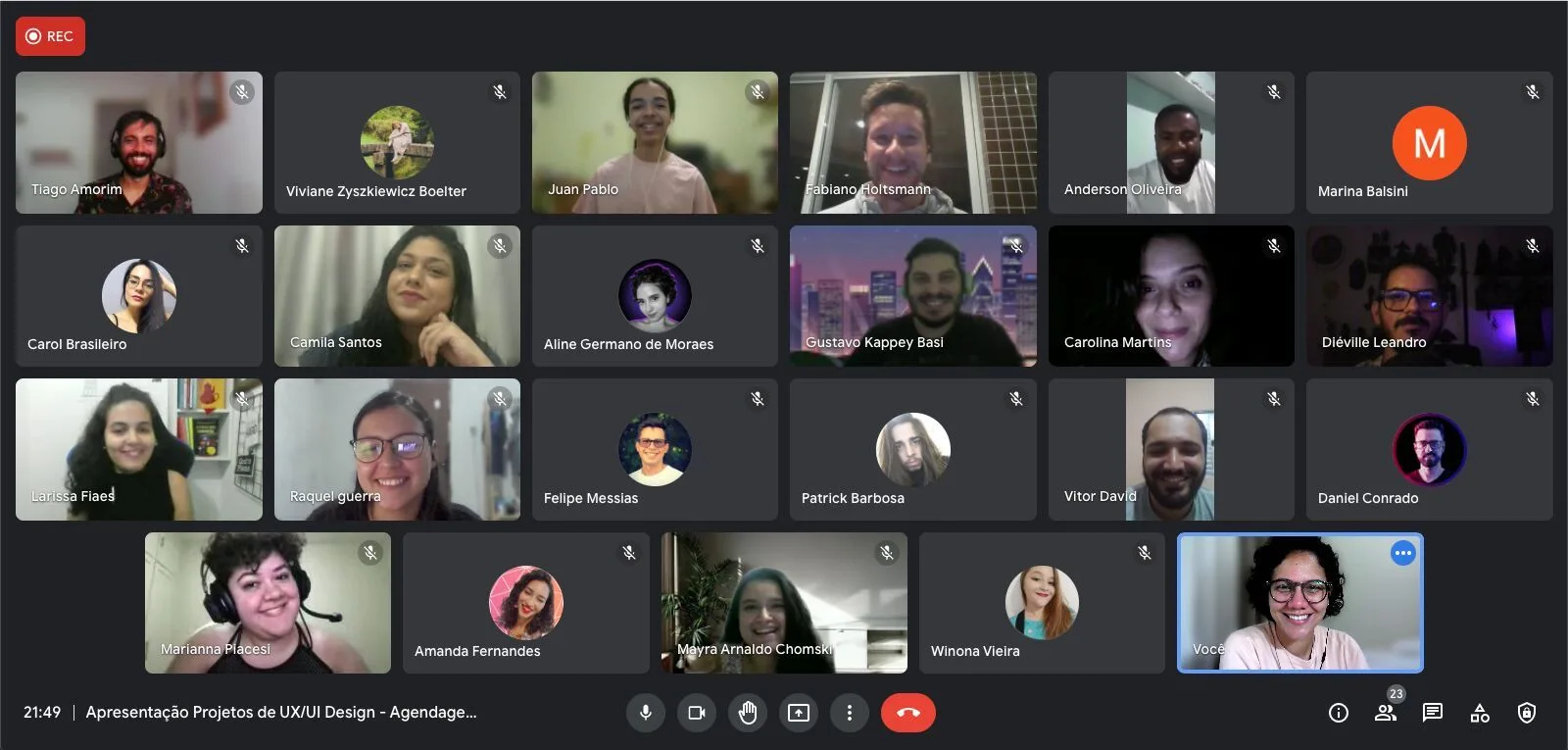
After 5 months of hard work, we had the demo meeting where we presented our project to Fabiano Holtsmann (founder and president of Agenda Geek), to the mentors and organizers of the challenge, and to the other teams that were competing.
After the presentation, we received compliments from everyone. All the teams did an excellent job. Out of 14 teams, 4 made it to the end, and ours was crowned champion, winning the challenge!
Demo Meeting
Next Steps & Learnings
- Handoff with the development team.
- Define and track success metrics (NPS, Heart, CTR, ...).
- Create a roadmap with the ideas that were not implemented in the first wave.
Improvements for the next project (backlog):
- Implement the roadmap created.
- Perform moderate testing to analyze the enrollment stage.
- Make all interface components responsive.
- Improve the usability of the registration form.
- Improve the look of the articles on the home page.
Team 86 - The Survivors!
❤️ Made with care by Team 86.
Evidence
Out of 14 teams, 4 made it to the end, and ours was crowned champion, winning the challenge. The platform was never built.