Field-Service Operations Product & Marketing Site
Eight-module field-service operations product, plus its Next.js marketing site.

Designed an eight-module operations product for a technical-assistance business — service desk, quoting, a work-order kanban, catalogues, customers and finance — then designed and coded its marketing site in Next.js. The product is live in production; a later team rebuilt it on a different stack, keeping the design.
- Role
- Sole designer of an 8-module operations product, and designer + front-end developer of the landing page
- Timeframe
- Jul 2025 – Aug 2025
- Stack
- TypeScriptTailwindFigma
- Evidence
- Live
- Design + code
- Source
- Product stack
'%3e%3cpath%20d='M0%2012H12V0H0V12Z'%20fill='%23007ACC'/%3e%3cpath%20d='M2.65365%206.0398L2.64984%206.53123H4.21174V10.9693H5.31651V6.53123H6.87841V6.04933C6.87841%205.78266%206.8727%205.5598%206.86508%205.55409C6.85936%205.54647%205.90889%205.54266%204.75651%205.54456L2.65936%205.55028L2.65365%206.0398Z'%20fill='white'/%3e%3cpath%20d='M9.68281%205.53633C9.98757%205.61252%2010.22%205.74776%2010.4333%205.96871C10.5438%206.0868%2010.7076%206.30204%2010.7209%206.35347C10.7247%206.36871%2010.2028%206.71919%209.88662%206.91538C9.87519%206.923%209.82948%206.87347%209.77805%206.79728C9.62376%206.57252%209.46186%206.47538%209.21424%206.45823C8.85043%206.43347%208.61614%206.62395%208.61805%206.94204C8.61805%207.03538%208.63138%207.09061%208.66948%207.16681C8.74948%207.33252%208.89805%207.43157%209.36472%207.63347C10.2238%208.003%2010.5914%208.2468%2010.82%208.59347C11.0752%208.98014%2011.1323%209.59728%2010.959%2010.0563C10.7685%2010.5554%2010.2961%2010.8944%209.63138%2011.0068C9.42567%2011.043%208.93805%2011.0373%208.7171%2010.9973C8.23519%2010.9116%207.77805%2010.6735%207.49614%2010.3611C7.38567%2010.2392%207.17043%209.92109%207.18376%209.89823C7.18948%209.89061%207.239%209.86014%207.29424%209.82776C7.34757%209.79728%207.54948%209.68109%207.73995%209.57061L8.08472%209.37061L8.1571%209.47728C8.25805%209.63157%208.479%209.843%208.61234%209.91347C8.99519%2010.1154%209.52091%2010.0868%209.77995%209.85442C9.89043%209.75347%209.93614%209.64871%209.93614%209.49442C9.93614%209.35538%209.919%209.29442%209.84662%209.18966C9.75329%209.05633%209.56281%208.94395%209.02186%208.70966C8.40281%208.44299%208.13614%208.27728%207.89233%208.01442C7.75138%207.86204%207.61805%207.61823%207.56281%207.41442C7.5171%207.2449%207.50567%206.82014%207.54186%206.64871C7.66948%206.05061%208.12091%205.63347%208.77234%205.50966C8.98376%205.46966%209.47519%205.4849%209.68281%205.53633Z'%20fill='white'/%3e%3c/g%3e%3cdefs%3e%3cclipPath%20id='clip0_23114_5'%3e%3crect%20width='12'%20height='12'%20fill='white'/%3e%3c/clipPath%3e%3c/defs%3e%3c/svg%3e)


A technical-assistance and repair business needed the system that runs its service orders end to end — from the moment a customer walks in with a broken thing to the moment the invoice is settled. Eight desktop modules, a deliberately small mobile surface, and the marketing site that sells the whole thing.
Agency work at Spaceapps; the client relationship belonged to the agency and I delivered as staff. The discovery was run by the tech lead, who handed me the board. From that board onward the product design was mine, alone — and the landing page was mine to design and to build.
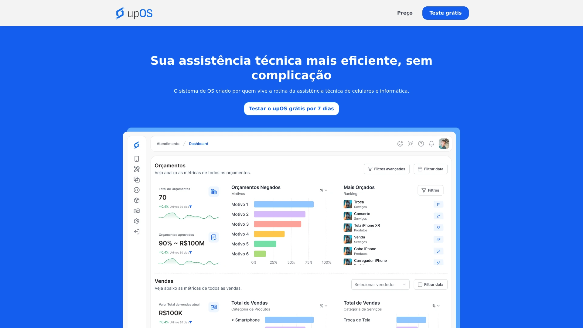
Front desk to money
A repair shop's real problem is not any single screen; it is that a device, a promise and an amount of money travel through the business at different speeds and in different people's heads. The front desk takes the device in. Somebody quotes it. Somebody else fixes it. Someone has to know, three days later, where it is and what was agreed. The system had to hold all of that in one place without turning the counter into a data-entry job.
- Authentication — the way in, and the only module that exists on every surface.
- Service desk — intake and quoting, where the promise to the customer is made.
- Assistance — the work itself, with a work-order kanban so the shop can see the queue rather than remember it.
- Services and Products — the catalogues that make a quote repeatable instead of improvised.
- Customers — the history that makes the second visit easier than the first.
- Finance — quoting through to settlement.
- Configuration — the settings that let one design fit shops that do not work identically.
- 8
- desktop modules designed
- 2
- of them on mobile, deliberately
- 26
- view/edit permissions, 8 areas
- 59
- files in the landing-page repo
The mobile surface is two modules, and that is the design decision
The phone gets authentication and service intake. Nothing else. Not because the rest was cut for time, but because intake is the part that happens away from the desk — someone standing at a counter or in the field with a customer in front of them — and the back office is not. Finance on a phone would be a feature nobody opens. This is the opposite of a responsive-coverage claim: two of eight is the answer, and mirroring all eight onto a small screen would have been the easier and worse decision.
The money path is invoicing, not checkout
It is worth naming precisely, because the wrong word here would flatter the work and misdescribe it. There is no cart, no checkout and no recurring commerce in this product. What there is: a quote that becomes an agreement, and financial control that follows it to settlement. That is business-to-business invoicing, and designing it well is a different problem from designing a store — the hard part is not payment, it is that the amount can change between the promise and the repair.
Permissions are a module, not three hardcoded screens
Discovery modelled three actors, and the obvious way to design for them is to draw three versions of every screen. I did the opposite. Access lives in Configuration as its own module: a profiles table — Admin master, Técnico, Vendedor — each showing how many users sit in it and whether it is active, and a profile builder holding roughly twenty-six individual permissions across eight areas of the product, every one of them split into view and edit. Ver financeiro and Editar financeiro are separate switches, and so are the kanban, the work orders, the parts orders and the reports. The shop can then define a profile I never thought of, which a shop with a night-shift technician will need and I could not have guessed.
The landing page
The marketing site was mine to design and to build, in Next.js: hero, banner, a how-it-works section, two feature-image sections, testimonials, an FAQ and a closing call to action, plus the cookies, privacy and terms set and a custom 404. At fifty-nine files it is the leanest repository of that period, and lean was the point — a marketing page for an operations product should load instantly on the worst connection in the shop.
What this is not
- Not my build of the product. I designed it; a Bubble developer built it and a later developer rebuilt it in Next.js.
- Not evidence of my engineering. The live application evidences my design, and the fact that the design survived a rewrite. The code behind that login screen has never been mine.
- Not the discovery. The tech lead ran it and handed over the board.
- Not a responsive-coverage claim. Two of eight modules exist on mobile, deliberately.
- Not proof that the other seven modules each render differently per profile. Access is specified in Configuration rather than drawn as per-role variants of every screen, so those variants do not exist in the file and I do not claim them.
- Not payments or checkout. Quoting plus financial control is invoicing.
- Not a date range for the engagement. The dates on this page bound the landing-page repository only — the product design came before it, and version control cannot date that.
- Not the site at the product's own address today. That is someone else's redesign at the address my page used to occupy.
The design outlived its own implementation
The most useful thing this project proves is not that it shipped. It is that when the application was rebuilt from scratch on a completely different stack, by a developer I never worked with, the design went across. Nobody redesigned it on the way. That is the closest thing a designer gets to a load test: the interface was specified clearly enough that a stranger could rebuild the thing underneath it and leave it standing.
Evidence
The product is live and running a real business today: anyone can reach the login screen. It evidences the design and not the engineering — the application was built in Bubble by another developer and later rebuilt in Next.js by an incoming one, and the design came through that platform rewrite intact, which is a harder test than shipping once. The landing page I built no longer exists at its original address; it was replaced by someone else's redesign after I left, so the copy on my own domain is the only surviving artifact of it, and it is a copy rather than the instance that served the client. No performance metric exists for this project — a confirmed absence, not an uncollected one.