Clinical Psychology Practice Site — Designed and Coded Solo
A one-page practice site taken from reference to deployed in a week, alone.
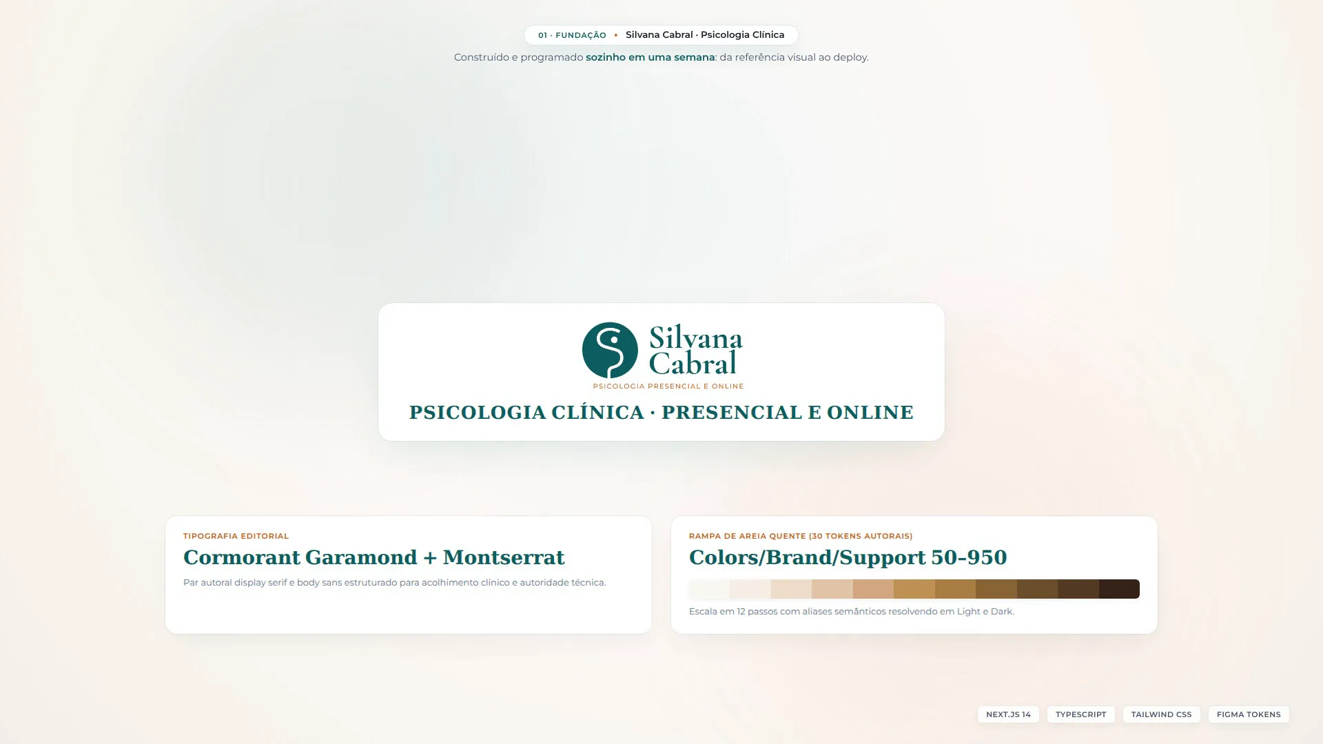
Took a solo clinical psychologist's one-page site from first reference to deployed in a week, by myself: moodboard, style guide, a twelve-section page and a twelve-step token ramp, then built as a static Next.js export over thirteen bespoke section components. The booking mechanism is written as code rather than decoration — seven distinct WhatsApp deep links, one per entry point. The photography is AI-generated; no photographs were available to work from.
- Role
- Sole designer and sole developer
- Timeframe
- Nov 2025 – Dec 2025
- Stack
- TypeScriptTailwindFigma
- Evidence
- Live
- Design + code
- Source
- Product stack
- Design file
'%3e%3cpath%20d='M0%2012H12V0H0V12Z'%20fill='%23007ACC'/%3e%3cpath%20d='M2.65365%206.0398L2.64984%206.53123H4.21174V10.9693H5.31651V6.53123H6.87841V6.04933C6.87841%205.78266%206.8727%205.5598%206.86508%205.55409C6.85936%205.54647%205.90889%205.54266%204.75651%205.54456L2.65936%205.55028L2.65365%206.0398Z'%20fill='white'/%3e%3cpath%20d='M9.68281%205.53633C9.98757%205.61252%2010.22%205.74776%2010.4333%205.96871C10.5438%206.0868%2010.7076%206.30204%2010.7209%206.35347C10.7247%206.36871%2010.2028%206.71919%209.88662%206.91538C9.87519%206.923%209.82948%206.87347%209.77805%206.79728C9.62376%206.57252%209.46186%206.47538%209.21424%206.45823C8.85043%206.43347%208.61614%206.62395%208.61805%206.94204C8.61805%207.03538%208.63138%207.09061%208.66948%207.16681C8.74948%207.33252%208.89805%207.43157%209.36472%207.63347C10.2238%208.003%2010.5914%208.2468%2010.82%208.59347C11.0752%208.98014%2011.1323%209.59728%2010.959%2010.0563C10.7685%2010.5554%2010.2961%2010.8944%209.63138%2011.0068C9.42567%2011.043%208.93805%2011.0373%208.7171%2010.9973C8.23519%2010.9116%207.77805%2010.6735%207.49614%2010.3611C7.38567%2010.2392%207.17043%209.92109%207.18376%209.89823C7.18948%209.89061%207.239%209.86014%207.29424%209.82776C7.34757%209.79728%207.54948%209.68109%207.73995%209.57061L8.08472%209.37061L8.1571%209.47728C8.25805%209.63157%208.479%209.843%208.61234%209.91347C8.99519%2010.1154%209.52091%2010.0868%209.77995%209.85442C9.89043%209.75347%209.93614%209.64871%209.93614%209.49442C9.93614%209.35538%209.919%209.29442%209.84662%209.18966C9.75329%209.05633%209.56281%208.94395%209.02186%208.70966C8.40281%208.44299%208.13614%208.27728%207.89233%208.01442C7.75138%207.86204%207.61805%207.61823%207.56281%207.41442C7.5171%207.2449%207.50567%206.82014%207.54186%206.64871C7.66948%206.05061%208.12091%205.63347%208.77234%205.50966C8.98376%205.46966%209.47519%205.4849%209.68281%205.53633Z'%20fill='white'/%3e%3c/g%3e%3cdefs%3e%3cclipPath%20id='clip0_23114_5'%3e%3crect%20width='12'%20height='12'%20fill='white'/%3e%3c/clipPath%3e%3c/defs%3e%3c/svg%3e)


A solo clinical psychologist needed a one-page site that could turn a visitor into a booked session. There was no CMS to build, no login and no backend: the entire booking mechanism was going to be WhatsApp. So the job was to make a single page carry the positioning, the reassurance and the opening line of a conversation — and then to build it.
Freelance work under Locuz, taken on after the Spaceapps era. Sole designer and sole developer: the reference pass, the moodboard, the style guide, the page design and the production build were all mine. There was no existing brand to work from, and the only photograph I was given was a single 150×150 profile picture.
The brief
One page, in Portuguese, for a clinical psychologist working alone. It had to do the work a practice website does when there is no reception desk behind it: say who she is and who she treats, name the feelings people actually arrive with, explain her approach, list the health plans she accepts, answer the questions that stop someone from writing the first message, and give directions. Twelve sections in the end, and every one of them earning its place on a page nobody scrolls twice.
No brand, one 150×150 photograph, two weeks
The project started from almost nothing: no logo, no palette, no type pairing, and one 150×150 profile picture. So the first half of the work was building the thing the design would then be made of — a visual-reference pass, a moodboard, logo explorations, and a style guide covering the palette, the Cormorant Garamond and Montserrat pairing, and the desktop and mobile grids. Underneath it, a twelve-step warm-sand ramp with semantic aliases that resolve in both light and dark.
- 12
- sections on the page
- 13
- bespoke section components
- 9
- shadcn primitives underneath
- 30
- design tokens authored
When the design was settled I marked the file released for development and then built it myself, as a static Next.js export: thirteen bespoke section components sitting on nine shadcn primitives, three legal pages and a custom 404. It was deployed a week in, and the second week was fixes and adjustments she asked for. Designing and building the same page has one specific advantage, and it is not speed. It is that nothing gets designed that cannot be built, and nothing gets built that quietly drops what was designed.
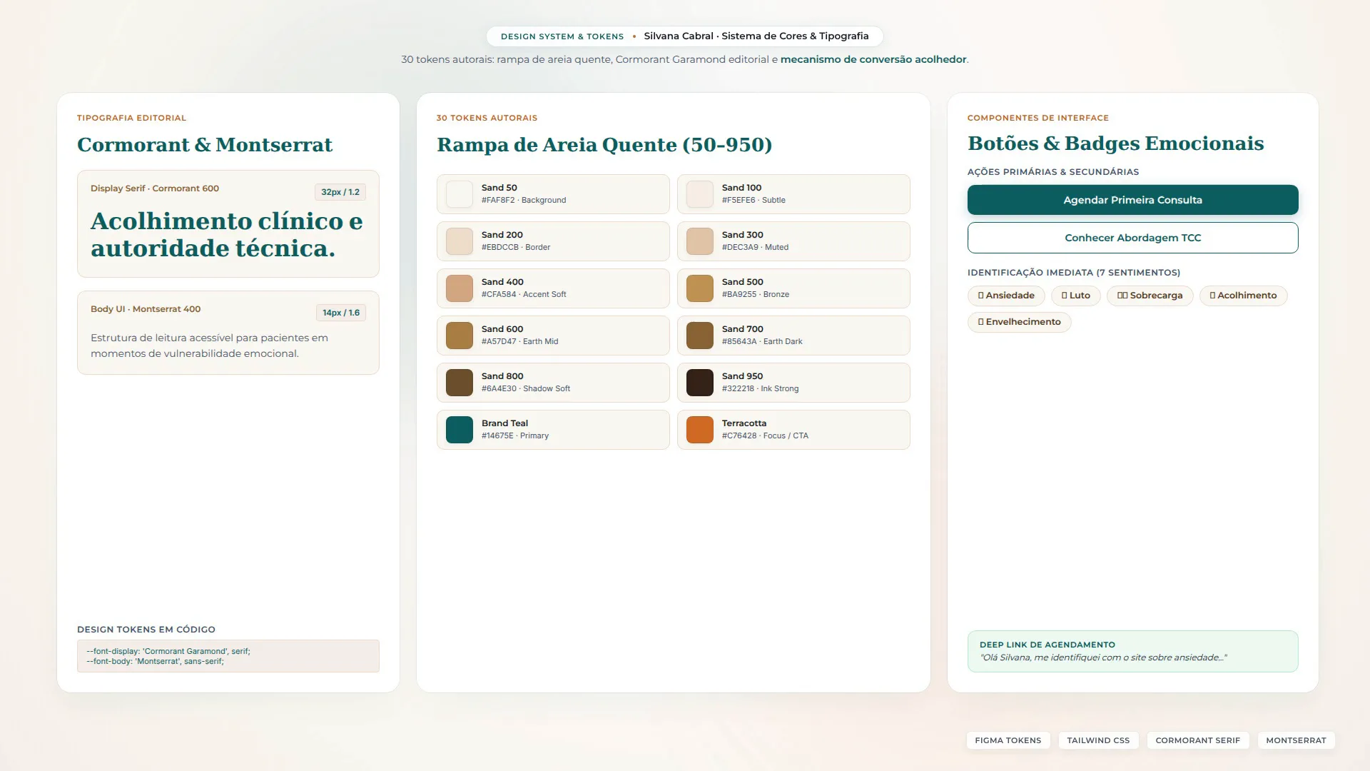
The booking mechanism is code, not decoration
WhatsApp was the entire conversion path, which meant the interesting design problem was not the button — it was what the message already says when the button opens the app. A visitor who has to compose their own first message to a psychologist is a visitor who closes the tab. So every entry point on the site opens WhatsApp with its own pre-written Portuguese message, phrased for the place the person was standing when they tapped: seven distinct deep links, fourteen rendered instances across the deployed page.
The one I am fondest of is on the 404, where the pre-filled message is not about booking at all:
não estou conseguindo acessar o site, pode me ajudar?
A broken link on a practice site is a person who wanted something and did not get it. Handing them a sentence that describes their actual situation costs one line of code and turns the worst page on the site into a working entry point.
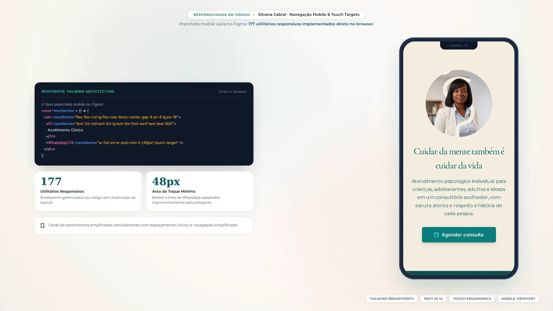
Responsiveness was built in the browser, not in Figma
The mobile artboard in the design file is empty, and that is not an omission I want to hide — it is how this one was made. The desktop page was designed at full fidelity and the responsive behaviour was then written directly in code, where the breakpoints actually live; the deployed HTML carries 177 responsive utility hits. It is a reasonable method when the same person designs and builds, and a bad one to hand to anybody else. On a project with a separate developer, the artboard gets drawn.
What this is not
- Not a backend. The Express file in the repository is dead template scaffolding and was never deployed; the site is a static export served by Apache.
- Not a themed site. The design file resolves a complete light and dark token set, but the deployed page ships no dark-mode utilities and the theming library goes unused. That was a scope decision under a tight clock, not a feature.
- Not competitive analysis. The large benchmark board in the file is ten full-scroll screenshots placed side by side — visual reference, nothing annotated and nothing synthesised.
- Not a 1,189-token design system. Thirty tokens were authored for this project; the rest of that number is inherited ramps that came with the base file.
- Not analytics. Only Google Tag Manager appears in the deployed page.
- Not my starter file. The base came from a course template, which I made production-grade through auto-layout and tokenisation — after which it became the default file everywhere I worked.
The collateral nobody asked for
A practice does not stop needing things once the site is up. Alongside the build I produced Instagram highlight covers, a business card, and a four-page walkthrough for setting up her email in Thunderbird, with annotated phone mockups. None of it was in scope. All of it was the difference between handing over a website and handing over something someone can actually run.
Evidence
The build was finished, deployed, and is still inspectable on my own host. It never went live under the client's own domain. The imagery is AI-generated, she did not want it representing her practice, and the root domain was parked to redirect to her Google Business Profile instead. The project went unpaid. I had asked for photographs and been given one 150×150 profile picture, so I generated the imagery rather than let the ship date slip; she turned it down, and that was the end of it. The artifact is real and the source is public. The lesson is worth more than the project was: photography is now a precondition I settle before the work starts, not a dependency I design around.